Sunday 26 January 2014

Double Page Spread

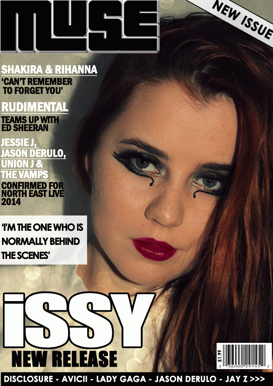
Millennium has had the first exclusive interview with the newest star on the music scene, Claire was sent to find out the latest from Issy to talk about her new number one hit and answers some of your questions! At just 17 years old, the star from Birmingham has had a huge success in a matter of weeks, all starting from her Youtube videos and being recognized by Roc Nation one of the biggest record labels founded by Jay-Z. 


Has the amount of fame/attention shocked you?
Yes! I didn’t expect such a good response. You can’t predict how well your song will go down with everyone; it still hasn’t sunk in that it went to number 1 in the UK! It’s very strange being recognised when I go out, and signing autographs is definitely a new experience.

·        Can you remind us of the title of your new single?
 It's called 'Careless' and it's a dance tune, we worked really hard on trying to make it memorable and catchy.

·       Did you write it yourself?
Yes, I wrote the song myself, I’ve been song writing since I was eleven so I’ve had lots of practise! I’m hoping my skills have improved since then though. I love spending time in the studio, it’s become my second home recently.

·        Have you written songs for any other celebrities?
I’ve co-written a few songs for a couple of underground artists in New York, but other than that... I’m yet to work with other celebrities. It would be so strange hearing a song I've written being sung by major artists, I mean could you imagine Rihanna singing your song!

·        How did you react to the fans response?
I was so shocked! I couldn’t believe it. I’m so grateful for every one of them. I can’t wait to start more promotional work and spend time meeting them.

·        Who do you take your musical inspiration from?
I take a lot of inspiration from smaller, less known artists that I have met over the last two years. I admire so many celebrities but I want to make sure I create my own style, so I try not to have too much similarity with them. I want to stand out, but in my own way.

·        Have you met any celebrities yet?
I have met a few... 

I got to chat to Katy Perry at the Jingle Bell Ball which was amazing! I have idolised her for such a long time.


·        Who would your dream collaboration be with?
That’s a difficult one, but it would probably be Lady Gaga. I love how fearless she is, and to collaborate and perform with her would be an incredible experience! I think our crazy personalities would match perfectly.

·        What were you doing before this recent success?
I’ve been writing and recording for a few years now, and I played at open mic nights as much as I could, but I was working as a make-up artist up until now!

·        Is this a dream for you?
Of course! I’ve only ever dared to dream about it though; I never thought it would become reality!

'I've only ever dared to dream about it'

·        Will you be releasing a new single soon?
I’m currently working on my new single now; it should hopefully be completed in the next couple of months. I am planning for it to be released on the 2nd of March 2014.

·        How would you describe your style of music?
I suppose pop/R&B, mainly music that you can dance to and have on at parties! But there’s usually a lot of meaning behind each one of my songs.

·        Will you be going on tour?
Maybe once my album is complete, that’s something I will aim for. I think any musicians dream is to have a sold out arena tour!

·        Have you thought of a name for your fans?
I haven’t yet, but I’m open for suggestions!

·        Are you working on an album?
I am *laughs* though I would like to keep it quiet and surprise people. I won’t give away too many clues.

·        Who is your fashion icon?
My fashion icons would have to be Paloma Faith and Lana Del Rey. I love the vintage pin up style, and they are both very classy and glamorous.

·        Can you play any musical instruments?
I can play the piano; I learnt when I was seven. I’ve also had a few guitar lessons but I’m not so good at that! The piano really helped with my song writing, I could write down the music and then put lyrics with it later.

·        From what age have you been singing?
I’ve always enjoyed singing from about the age of 5, but I never thought I was any good and I definitely didn't think it was possible to achieve a number one hit!

·        What music do you listen to?
Hmm the type of music I listen to varies, I love to listen to lots of different things and explore different styles. My favourite song at the minute would have to be ‘Puppy Love’ by Lana Del Ray.

·        Are there any exciting celebrity events that you have been invited to?
I’ve been invited to the Brit awards in February! I was so surprised to be asked to go… I’m really excited, I will have to decide what to wear *laughs* can’t wait!

·        Where do you see yourself in the next 12 months?

I’m not sure quite yet, I wasn’t expecting such a huge response from my single but I will carry on writing and recording some more songs and hopefully be on tour! Who knows what will happen.

Final front cover

This is my final front cover, I have chosen to use this photograph of my model because it is the most engaging as it is a close up, and she is looking directly towards the camera. The image has been positioned in the centre of the page, the masthead 'Millennium' has been placed across the top. It's in a white sans-serif font which is quite simple but makes it clear and bold. The main headline is 'Issy' which is in the second largest font size as it is important, it's again in a white sans-serif font with a black stroke around the outside which makes it stand out and informs the reader what the main article/feature is about. The strap line underneath it is 'Brand new release', the 'NEW' is emphasized and in a red/pink colour which links my three house colours of black, white and cerise. The barcode has been placed in the bottom right hand corner which makes it look more professional, the price is '£1.99' as that is an affordable price according to the feedback from my questionnaire and the issue date has been put next to the barcode so it informs the reader how recent it is. The black banner has been kept the same, with more celebrity names to intrigue a wider audience, especially their fan base. The pull quote has been moved closer to the main headline so it is clear that it links with the 'Issy' headline and it has been put in a bolder font to make it more prominent. The headlines are down the left hand side, the celebrity names have been underlined  and I have added a cerise dotted line underneath to separate them and give it a organised structure. The cover lines give the reader more information, I added an extra one about 'The Vamps' to cover more and fill space.  I created a more exciting pug which is in the top right hand corner, it says 'First Issue' in the middle which creates more interest and around the outside it says 'Win VIP tickets to see Katy Perry:' which attracts potential readers as it implies there is a competition inside and again uses my three main house colours

Sunday 19 January 2014

Fifth draft of cover

This front cover uses a close up shot of my model, I have edited the photo on www.picmonkey.com by firstly cropping it then adding the same effects of 'Cross Process' and 'Tranquil' to brighten the colours and make it look like a more professional photograph. I have used the masthead 'Millennium' which goes across the top of the page, in a white sans- serif font which makes it look bold. The pull quote is in the top left hand corner which is in white, spaced out text so it's easy to read. The white circular pug with a black outline is in the opposite top corner with 'NEW' in the centre which is in 'Impact' font so it stands out to my potential audience and it may help generate more interest in the magazine. The main headline is 'Issy' which is in a large size and is in white with a black outline to match the pug, this makes it more prominent so it stands out from the photograph. Underneath, the strap line is 'Brand new release' where again the emphasis is on 'NEW' because this is the word that will catch the readers attention. Other headlines are celebrity/band names which are underlined and in a slightly larger font to appeal to their fan base, the cover lines give the potential buyer/reader more information about what articles/features are included inside and intrigues them to pick it up. The black banner has been kept in the same place (across the bottom) with more celebrity names to appeal to a wide audience, they are all pop artists which is important to keep it linked with my pop genre. The bar code has been positioned in the bottom left hand corner to make it look like a real magazine and the price is displayed at '£1.99' which is a reasonable price according to my questionnaire feedback. 

Saturday 18 January 2014

Fourth draft of cover

This front cover uses a mid shot of my model, I have added a paint effect over the top of the original photograph to make it look more arty and the bright colours link to the genre of pop and make it look fun and youthful which matches my brand identity. I have used the masthead 'Loud' across the top of the page which has been placed behind the model, it is in the largest size and adds to the visual syntax. The pull quote has remained the same, 'I'm the one who is normally behind the scenes' has been placed in the top right in bold, spaced out text to ensure it is clear which will intrigue my potential audience to read the magazine. The main headline is 'Issy' which is outlined in black to make it stand out on top of the photo. Underneath the main headline there is a strapline, the 'NEW' is more emphasized as it's bolder and in a 'impact' font because it's the most important word and will stand out to potential readers/buyers. The black banner has been kept the same with celebrity names so it appeals to a wider audience, they are both female and male artists which means it's suitable for both genders. A bar code is placed in the bottom right hand corner to make it look like an actual magazine and the price is also displayed. The headlines are down the left hand side, the celebrity names are underlined and in a slightly larger size and the strap lines are underneath to add extra information. 

Third draft of front cover

This front cover again uses a close up shot of my model looking directly into the camera. My model has deliberately been positioned more towards the right hand side so there is enough space for the headlines down the left hand side which shows an organised layout. The celebrity names have again been underlined as they are the most important , and the straplines underneath are in a smaller size. I have used another masthead of 'Muse' which has been placed in the top left hand corner which adds to the visual syntax as the potential reader should notice it first. A 'New Issue' white banner has been put across the right hand corner with a black outline to draw attention to it and may interest more people. The main headline has stayed the same, 'Issy' as it is important that the new stars name is in a large, clear, bold font which is more prominent than the rest of the text. Underneath the strapline is 'New Release' which is in a smaller 'Impact' font but gives the potential reader/buyer an idea of what the magazine is about. The black banner across the bottom of the page has also remained the same as it clearly shows what other celebrities are included inside which will intrigue a larger audience. The bar code has been placed in the bottom right hand corner which makes it look more professional and it also displays the price of '£1.99',  which according to my questionnaire is the price that most people are willing to pay. The pull quote 'I'm the one who is normally behind the scenes' has been positioned on top of a white, rectangular pug (the transparency has been reduced slightly) which makes it stand out more. 

Thursday 16 January 2014

Second draft of front cover

This is another front cover idea for my pop music magazine, I have used the edited close up shot of my model looking directly into the camera so there is eye contact which is more likely to catch the attention of my potential audience. The masthead 'Millennium' is in 'Franklin Gothic Demi Cond' font which is quite simplistic however it is clear and bold. The bar code has been placed in the top left hand side to give my magazine as sense of professionalism. The pug is a white circle with a black outline to make it stand out, with 'NEW' in the middle this tells the reader it's a new issue and may persuade them to take a look. The pull quote 'I'm the one who is normally behind the scenes' has been placed next to the model on the left hand side which suggests she has said it and intrigues my potential audience to read on to find out more, the text is in a 'Century Gothic' white font which is clear. The main headline is 'ISSY' which is white with a black outline to make it more prominent, informs the reader that is what the main story/feature is about. The smaller headlines are on the right hand side, the celebrity names are in white, underlined and in a slightly larger size as they are the most important. Then the straplines are underneath in black writing, using the 'Century Gothic' font again to keep it all linked. There is a black banner across the bottom of the page with more celebrity names to encourage fans to read it. The house colours on this cover are black, white and purple which has been used in the text and in the image to keep everything connected.

Photo editing for my front cover


I have used www.picmonkey.com to edit this photograph, firstly it had to be cropped as it was originally a landscape photo so it has been made portrait. I then added the 'Cross Process' effect in blue which tinted the photo slightly, then the 'Tranquil' effect was added over the top to increase the brightness and make the photograph look of a sharper, higher quality to catch the attention of potential buyers/readers. The make up effects were useful to boost my model's facial features, I chose a vibrant pink lipstick and added the eye shadow effect to darken her eyes and finally used the 'blemish fix' to give it an airbrush finish to make it appear more professional. 

Monday 13 January 2014

First draft of front cover

This is my first attempt at a front cover for my pop music magazine, I have edited the original photo on http://www.picmonkey.com/ by adding the 'Cross Process' effect in blue which changes and enhances the colour slightly. I have used the 'Boombox' masthead as I thought it was most connected word with music and clearly informs the reader what genre of magazine it is, it is in white which makes it look quite simplistic but effective. The main headline is 'ISSY' which is in the largest font with a black outline to ensure it stands out from the rest of the cover, this tells my potential buyers who the magazine is largely based on. Underneath it says 'NEW release', the emphasis is put on 'NEW' due to it being bold which intrigues the reader. The cover lines are  current artists names over a white rectangular pug, which shows who is included inside which would persuade readers to read/purchase it, especially if they were interested in that particular celebrity. The bar code makes it look more professional and adds to the look of an actual music magazine, the price is also displayed in the top left hand corner of the bar code. 'Katy Perry' and 'Chase&Status' are also in large text (century gothic) as they will be main topics in the magazine and their fans will automatically be encouraged to read/purchase the magazine. There is a white stroke separating the two names which makes the structure clearer and so the text doesn't appear to be too crowded.