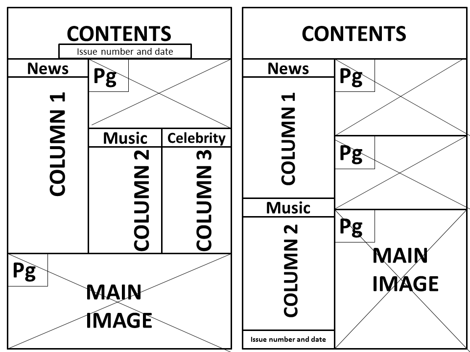
Sunday 16 February 2014

Conventions and research of a double page spread


  • A large image- of artist who has been interviewed.
  •  A pull quote - taken from the interview with the celebrity.
  •  Bold text – important names.
  •  A stand first – introduction to the article/feature.
  • Text – size 11, same size used throughout.
  • Drop cap – usually bold, tells reader where to start reading.
  • Columns – usually 2-4 to keep an organised structure.
  • By-lines – put under images to credit photographer.
  • Short headline- Usually just 1 or 2 words to state what the feature is about.
  • Usually follows same colour scheme.
  •  Informal tone - Quite chatty, especially if it's an interview.
  • Allow title to bleed onto the other page to show the pages are linked.
This double page spread is from 'Q' music magazine, it is focused on Lady Gaga which is evident as the whole left hand page is taken up with a professional, high quality photograph of her which is in black and white. The photograph is quite seductive and controversial as there is a lot of skin showing which conveys Lady Gaga's outrageous personality. The large red 'L' in a serif style font overlays the text, it stands for the subjects name so the reader can link the image to the text, it also adds an element of interest and makes it look more exciting. The heading at the top says 'lady GAGA' to clearly state what the feature is about, 'lady' is in a more feminine, flirtatious, sophisticated font where as 'GAGA' is emphasized in capital letters which suggests her madness. A faint stroke has been placed underneath to separate the title from the rest of the text and it's in a larger font because it's more important. There are 3 columns which consist of small text, this follows the typical conventions of a double page spread. There are two drop caps, the 'S' in the first column and the I in the third column which suggests those are important parts of the feature and draws the reader's attention to it. The colour scheme matches that of the Q magazine (red, white and black) which keeps a constant link between each page. The date, page number and logo of the magazine are placed in the bottom right hand corner which again follows typical conventions of a double page spread and reminds the reader while continuously promoting 'Q' magazine. 

Page furniture:
  •       Pull quote
  •       Crosshead
  •       Opinion Box
  •       Boxouts
  •       Folio and slug
  •       Reader interaction
  •        Information Bar
  •       Drop Cap
  •       Header sell/strap
  •       Byline
  •     Caption/Caption header 

Double Page Spread Layouts


Final Contents Page

This is the final mock up, I have tried to follow the conventions of a typical Contents Page to show a clear structure. The Title 'Contents' is across the top of the page in simple sans- serif font, I have kept the image of Issy the same of her in a black dress and heels and have placed her sitting in front of the 'O' which adds an element of interest. The issue month and year has been placed in the top right hand corner to make it stand out to the reader to show how recent and up to date it is, this has been balanced out with 'Millennium' in the top left hand corner. There is one main column down the left hand side which has Features, Reviews and Every Week sections, these sub-headings separate the text and make it more organised. Then there is an 'Exclusive' box creating a second column. I have kept my house colours the same (Black, White and Cerise) from my front cover to maintain the same theme for my music magazine. The page numbers are positioned next to the corresponding sub-title and I have used a particular font from dafont.com for the numbers placed next to the images to make them prominent. I have kept a similar font for all the text, either using Arial or Century Gothic which is the same as my front cover to keep them linked and to make it look professional. The main image is of Issy because she is the main focus in this issue of my music magazine, then I have used a smaller image of Katy Perry (photographed at The JingleBell Ball) to promote the competition to win 2 VIP tickets and a image of Scott Innes (photographed at the Clothes Show Live) to talk about him as a new artist. 

More developments of Contents Page


These mock ups of my contents page are very basic, the text size must be smaller to allow more room for information. The columns must be organised, I think it will work best if I have one main column down the left hand side and then a 'Exclusive' Box in the bottom right hand corner.
It's important that my music magazine appeals to both males and females, therefore the photos must show a range of artists/bands and the features/reviews must involve news of both genders so it will be interesting to a wide audience. The Title in the first one takes up a lot of space which means the text would look crowded so it's better if the title 'Contents' is kept simple like the second one. I will separate the text into Features, Reviews, Every Week and Exclusive to maintain a clear structure and I will use a maximum of 4 photos so it's not too image dominated as the text is important on the Contents page to inform the reader of what is featured inside the magazine. 

Developments of Contents Page

I have used grids and guidelines to create an organised layout, I have used a photograph of
Issy to place across the title 'Contents' which makes it look more exciting and fun. I have experimented with the 'M' sign behind the title to give it connection with the magazine name 'Millennium'. The Issue month and year has been placed in clear view so the reader can see how up to date it is. I have created a black banner to go across the top right hand corner which says 'Win Wireless Tickets' to intrigue readers to purchase the magazine and find out how to take part in the competition. I have placed the subscription web address at the top in the centre to make it stand out, however it may appear quite crowded so I may move it to create more space. I have used two photograph options of Issy to see which one works best, in my opinion I think the second one does because she sits well on the letter which makes it look artistic. 

Sunday 9 February 2014

Contents Page Conventions and Research

This contents page from 'Q' magazine is quite minimalistic, but it has an organised structure.
The heading is ‘Contents’ which makes it clear what the page is about and it has the magazines logo next to it which is ‘Q’ in white over a red, square pug. The magazines strap line has been placed underneath, ‘Discover great music’ is in a red font which links the house colours of red, white and black. The issue number has been put in a red circular pug which makes it stand out, the grey lines add to the design to create a further sense of interest. The main image is of a main article/feature, in this case Lana Del Rey; the page number on the photo corresponds to the headline in the column down the left hand side and then the page number for further in the magazine. The headline 'Features' is in a red rectangular banner to draw attention to it. The page numbers are emphasized so the reader is drawn to different stories and can see them easily. There are 3 smaller images of different celebrities/groups which gives it more variety and excitement, which again have the page number to make it organised. There is a cursor shape hovering over the smaller image at the top which links to downloading the songs online and adds to the design. There are only 5 cover lines which means it’s spaced out and not too crowded, the celebrity names are in capital letters and in a slightly larger font because they are the most important. Then underneath there is more information about what the feature entails. In the bottom right hand corner there is the issue month and number which informs the reader how up to date it is, and another small 'Q' logo. In the bottom left hand corner there is a web address which allows the reader to subscribe for a regular issue which appeals to music lovers.