Third draft of front cover
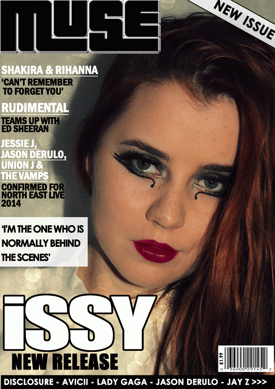
This front cover again uses a close up shot of my model looking directly into the camera. My model has deliberately been positioned more towards the right hand side so there is enough space for the headlines down the left hand side which shows an organised layout. The celebrity names have again been underlined as they are the most important , and the straplines underneath are in a smaller size. I have used another masthead of 'Muse' which has been placed in the top left hand corner which adds to the visual syntax as the potential reader should notice it first. A 'New Issue' white banner has been put across the right hand corner with a black outline to draw attention to it and may interest more people. The main headline has stayed the same, 'Issy' as it is important that the new stars name is in a large, clear, bold font which is more prominent than the rest of the text. Underneath the strapline is 'New Release' which is in a smaller 'Impact' font but gives the potential reader/buyer an idea of what the magazine is about. The black banner across the bottom of the page has also remained the same as it clearly shows what other celebrities are included inside which will intrigue a larger audience. The bar code has been placed in the bottom right hand corner which makes it look more professional and it also displays the price of '£1.99', which according to my questionnaire is the price that most people are willing to pay. The pull quote 'I'm the one who is normally behind the scenes' has been positioned on top of a white, rectangular pug (the transparency has been reduced slightly) which makes it stand out more.
No comments:
Post a Comment