This is my final front cover, I have chosen to use this photograph of my model because it is the most engaging as it is a close up, and she is looking directly towards the camera. The image has been positioned in the centre of the page, the masthead 'Millennium' has been placed across the top. It's in a white sans-serif font which is quite simple but makes it clear and bold. The main headline is 'Issy' which is in the second largest font size as it is important, it's again in a white sans-serif font with a black stroke around the outside which makes it stand out and informs the reader what the main article/feature is about. The strap line underneath it is 'Brand new release', the 'NEW' is emphasized and in a red/pink colour which links my three house colours of black, white and cerise. The barcode has been placed in the bottom right hand corner which makes it look more professional, the price is '£1.99' as that is an affordable price according to the feedback from my questionnaire and the issue date has been put next to the barcode so it informs the reader how recent it is. The black banner has been kept the same, with more celebrity names to intrigue a wider audience, especially their fan base. The pull quote has been moved closer to the main headline so it is clear that it links with the 'Issy' headline and it has been put in a bolder font to make it more prominent. The headlines are down the left hand side, the celebrity names have been underlined and I have added a cerise dotted line underneath to separate them and give it a organised structure. The cover lines give the reader more information, I added an extra one about 'The Vamps' to cover more and fill space. I created a more exciting pug which is in the top right hand corner, it says 'First Issue' in the middle which creates more interest and around the outside it says 'Win VIP tickets to see Katy Perry:' which attracts potential readers as it implies there is a competition inside and again uses my three main house colours.
Sunday, 26 January 2014
Sunday, 19 January 2014
Fifth draft of cover
Saturday, 18 January 2014
Fourth draft of cover
This front cover uses a mid shot of my model, I have added a paint effect over the top of the original photograph to make it look more arty and the bright colours link to the genre of pop and make it look fun and youthful which matches my brand identity. I have used the masthead 'Loud' across the top of the page which has been placed behind the model, it is in the largest size and adds to the visual syntax. The pull quote has remained the same, 'I'm the one who is normally behind the scenes' has been placed in the top right in bold, spaced out text to ensure it is clear which will intrigue my potential audience to read the magazine. The main headline is 'Issy' which is outlined in black to make it stand out on top of the photo. Underneath the main headline there is a strapline, the 'NEW' is more emphasized as it's bolder and in a 'impact' font because it's the most important word and will stand out to potential readers/buyers. The black banner has been kept the same with celebrity names so it appeals to a wider audience, they are both female and male artists which means it's suitable for both genders. A bar code is placed in the bottom right hand corner to make it look like an actual magazine and the price is also displayed. The headlines are down the left hand side, the celebrity names are underlined and in a slightly larger size and the strap lines are underneath to add extra information.
Third draft of front cover
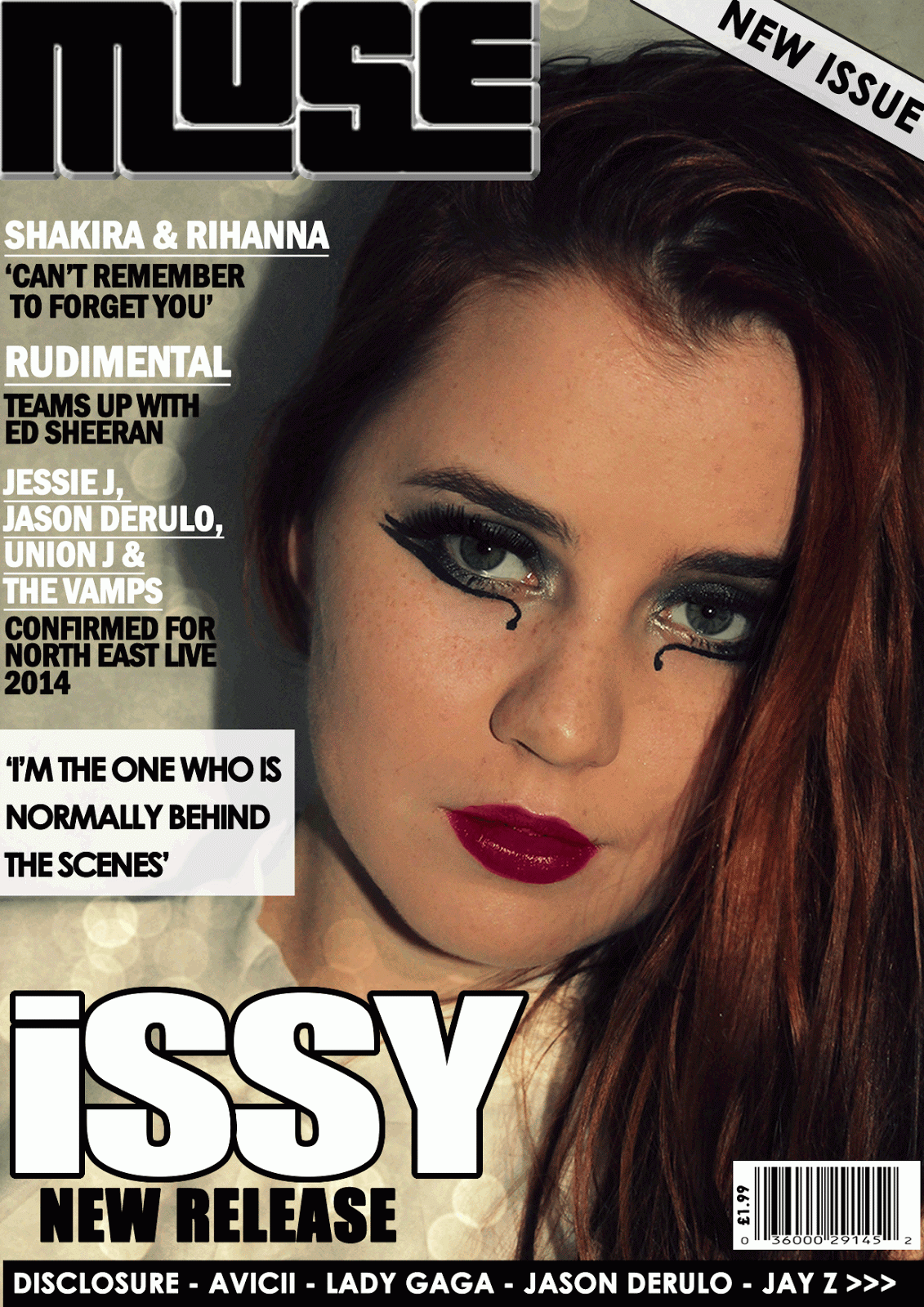
This front cover again uses a close up shot of my model looking directly into the camera. My model has deliberately been positioned more towards the right hand side so there is enough space for the headlines down the left hand side which shows an organised layout. The celebrity names have again been underlined as they are the most important , and the straplines underneath are in a smaller size. I have used another masthead of 'Muse' which has been placed in the top left hand corner which adds to the visual syntax as the potential reader should notice it first. A 'New Issue' white banner has been put across the right hand corner with a black outline to draw attention to it and may interest more people. The main headline has stayed the same, 'Issy' as it is important that the new stars name is in a large, clear, bold font which is more prominent than the rest of the text. Underneath the strapline is 'New Release' which is in a smaller 'Impact' font but gives the potential reader/buyer an idea of what the magazine is about. The black banner across the bottom of the page has also remained the same as it clearly shows what other celebrities are included inside which will intrigue a larger audience. The bar code has been placed in the bottom right hand corner which makes it look more professional and it also displays the price of '£1.99', which according to my questionnaire is the price that most people are willing to pay. The pull quote 'I'm the one who is normally behind the scenes' has been positioned on top of a white, rectangular pug (the transparency has been reduced slightly) which makes it stand out more.
Thursday, 16 January 2014
Second draft of front cover
This is another front cover idea for my pop music magazine, I have used the edited close up shot of my model looking directly into the camera so there is eye contact which is more likely to catch the attention of my potential audience. The masthead 'Millennium' is in 'Franklin Gothic Demi Cond' font which is quite simplistic however it is clear and bold. The bar code has been placed in the top left hand side to give my magazine as sense of professionalism. The pug is a white circle with a black outline to make it stand out, with 'NEW' in the middle this tells the reader it's a new issue and may persuade them to take a look. The pull quote 'I'm the one who is normally behind the scenes' has been placed next to the model on the left hand side which suggests she has said it and intrigues my potential audience to read on to find out more, the text is in a 'Century Gothic' white font which is clear. The main headline is 'ISSY' which is white with a black outline to make it more prominent, informs the reader that is what the main story/feature is about. The smaller headlines are on the right hand side, the celebrity names are in white, underlined and in a slightly larger size as they are the most important. Then the straplines are underneath in black writing, using the 'Century Gothic' font again to keep it all linked. There is a black banner across the bottom of the page with more celebrity names to encourage fans to read it. The house colours on this cover are black, white and purple which has been used in the text and in the image to keep everything connected.
Photo editing for my front cover
I have used www.picmonkey.com to edit this photograph, firstly it had to be cropped as it was originally a landscape photo so it has been made portrait. I then added the 'Cross Process' effect in blue which tinted the photo slightly, then the 'Tranquil' effect was added over the top to increase the brightness and make the photograph look of a sharper, higher quality to catch the attention of potential buyers/readers. The make up effects were useful to boost my model's facial features, I chose a vibrant pink lipstick and added the eye shadow effect to darken her eyes and finally used the 'blemish fix' to give it an airbrush finish to make it appear more professional.
Monday, 13 January 2014
First draft of front cover
Subscribe to:
Posts (Atom)